Exp 1 - Getting You Up to Speed with HTML / CSS / PHP

Ryuzaki

お前はもう死んでいる
Moderator
BuSo Pro
Digital Strategist
Joined
Sep 3, 2014
Messages
6,131
Likes
12,787
Degree
9
1header.png


HTML / CSS - the bane of many internet professionals' existence.

I know a few folks making six figures and even seven figures who don’t know a lick of HTML or CSS (I know a lot more wealthy people who have educated themselves on these topics though).

It’s been handed to us all neatly packaged from day one. Old sites like Geocities provided WYSIWYG editors. Wordpress provides themes, widgets, and customizers now. Theme developers include a thousand convoluted options. Now you’re 5 years deep into the game and simply don’t have the time to learn because you’re too busy doing.

And all of this keeps you stuck.​

“But Ryuzaki, does a race car driver need to know how to build an engine in order to drive his car?” No, but that’s not even a decent analogy. That’s an excuse.

Think of a skill like HTML & CSS as a multiplier on your earnings. When you don’t know the absolute bare basics of your craft, you can still make cash. You can pay someone else to take care of it or use the design options mentioned above. But the trade off is time, cash, and opportunity cost, especially at the beginning of your journey when you’re outsourcing things because you can’t afford to assemble a full on team.

I can't imagine being one of these guys that wants to change one little thing on their themes and have to hire a developer at developer costs per hour to do something that's basically ABC 123 for them.

What ends up happening in these cases of earning but not knowing the basics is that you scale in growth because that's all you can do to keep your earnings climbing. But a lot of money is left on the table due to the headache of hiring someone else every time you want to make the smallest change on your site. You decide to not split test at all and build another offer or another site. You end up leaving money on the table.

We don't need to discuss the thousand reasons why you should learn HTML & CSS any more than discuss the merits of exercise and a proper diet. It's obvious to all of us and just a matter of doing it.

The Goal
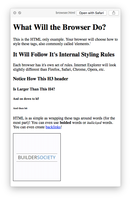
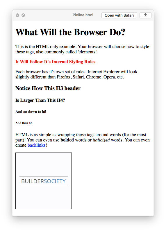
What I'm going to do here is summarize all of the basic information regarding HTML and CSS is quickly as possible to get you up to speed.

The ultimate goal here is not mastery. I don't want you to walk away from this knowing how to write all of this code from memory. The goal is for you to be able to look at the pre-built code of your websites and understand what you're reading and be able to make alterations with a quick Google search or two.

It's like the butterfly effect. It's like throwing a pebble into a pond at the start of your journey. The sooner you can toss in this pebble, the more those small waves can propagate and combine with other waves to create tsunamis. Don't settle for flooding your competitor's cities when you can topple over buildings and destroy infrastructure to the point people stop even trying to compete with you. It all starts with the basics.

After we wrap up this starter's tutorial, feel free to ask any question related to HTML & CSS (beginner, intermediate, or advanced) and myself and others will be more than happy to keep sharing and learning from each other.

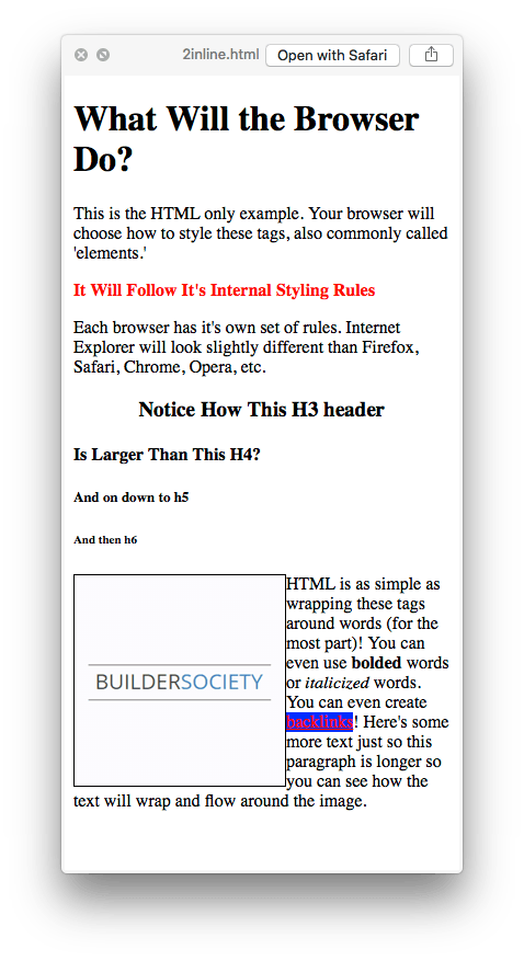
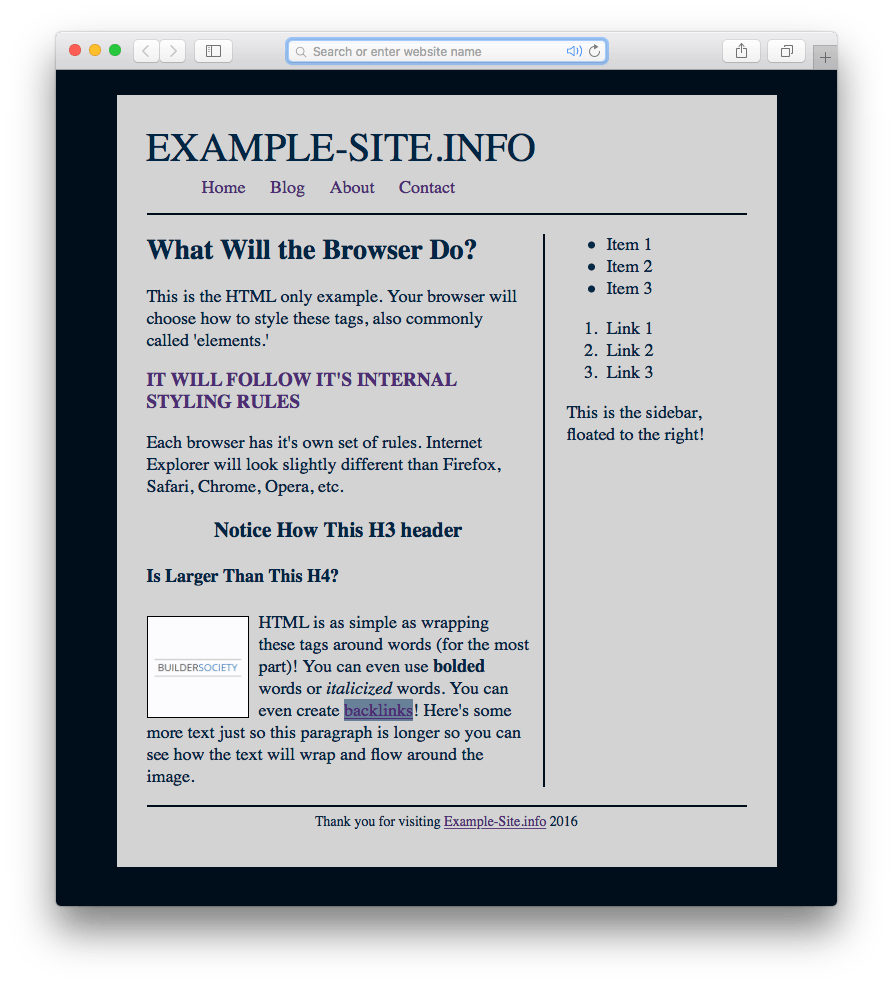
Let's get started with the easy, essential HTML tags you need to know.
 
2html.png


HTML stands for HyperText Markup Language.

Hyper, in this sense, means "meta" or beyond the veil of what users on the internet actually see. It's entirely based on tags. These tags surround pieces of your content and give the browser some context as to what you're intending on displaying to the user. They are the fundamental building block of websites.

Every browser has a set of rules for how to style each of these tags. And every company's browser does this a bit differently, and since we want to provide a consistent user experience to everyone we'll later learn how to override these styling rules with our own using CSS.

The Fundamental Tags

So what are these tags that browsers expect to see and already know how to handle? The same ones that you use for on-page SEO. The same ones that search engine spiders read. Classically, they are:

HTML:
<!DOCTYPE html>
<html>
<head>
<title>
<body>
<h1>...<h6>
<p>
<a>
<img />
<b>
<i>
<ul>, <ol>, <li>
<div>
<span>

While there are a few more (especially with HTML5 out now), these are the ones you need to recognize. Let's start from the top and talk about what each one is for. The first thing you'll notice is that each one is an abbreviation, word, or letter wrapped in opening and closing brackets.

<!DOCTYPE html>
Browsers need to understand when you're about to bust some HTML out on them. You can get away without this, especially if you're using a .html text file and have <html> tags included, but you won't pass an HTML validation check (which has SEO implications). Declaring the type of document as HTML at the top of your file (or header file, as you'll see later) leaves no doubt about what the browser is reading. Do yourself the favor of always including it, because there's other information you can stuff in there later. You do not need to close this tag. All others must be closed, except self-closing tags like <img />

<html>
All of your HTML needs to be wrapped in an <html> tag. Right below your <!DOCTYPE html> declaration you open the <html> tag and then you don't close that sucker until the very end of your footer. You close it and other tags by inserting a forward slash right after the opening bracket, like this = </html>. That forward slash is critical or you're opening another tag instead of closing it!

<title>
You know how the top of your browser will have the title of a page? Not in the screen, but in the browser's top bar itself, usually above the address bar or in the "name" of the tab? That's what <title> does. It tells the browser what to show there. This is also what search engines use to display as the title of the page in their rankings. There is another similar tag called <meta> that you know about from the On-Page SEO day of the course.

<head> and <body>
These two tags can be styled, but their main purpose is for context... for you, for the browser, for the spiders. It tells everyone where the supplemental content (like your logo, main navigation, and meta information) end and where the real meat begins. Google and the others are smart enough to know what's the sidebar and footer as well, but HTML5, the newest version of HTML includes new tags like <footer>, <article>, and things like that for further clarification. They aren't widely adopted by designers yet and aren't a must. For the sake of brevity and simplicity we're going to stick to the classics.

<h1> <h2> <h3> <h4> <h5> <h6>
These are your headers, just like in Microsoft Word and books you read. They are styled in decreasingly smaller sizes, but usually always bigger than your basic text on the page. They should always be nested, meaning you should never suddenly use an <h5> if you haven't used 1 through 4 yet. Always in order, always inside of one another, or you aren't writing valid HTML. These are critical for SEO, especially H1, H2, and H3.

<p>, <b> and <i>
p stands for Paragraph. Every single paragraph is wrapped in <p> at the start and </p> at the end. CMS's like Wordpress add them invisibly, but they're there in the final HTML. b stands for Bold, and is the new version of <strong> which you might still see around. i is for italics, which is the new version for <em> which meant emphasis and is also deprecated but still around.

To be clear, HTML5 is the newest version that places a lot of emphasis (no pun intended) on semantics. They want you to use "italics" for something like a book title and "emphasis" for when you really want to get your point across. The same goes for "bold" (use for titles, headers, and stylistic choices) and "strong" (use for getting your point across in a fierce way).

<a>
a stands for Anchor. This is how you create hyperlinks from your webpage to another webpage on your site or to another external website other than your own. We'll talk about how to use it in more detail soon. Just know, if you want to create an external link then you have to include http:// or https:// at the beginning, or it'll automatically create a broken internal link.

<img />
img stands for Image. This is how you display images on your website. Again, we'll talk about this more further down. But take notice now that it's a self-closing tag. There is no such thing as </img>. Most browsers won't break if you forget to self-close it like you see above, but it's not valid. It's self-closing because it doesn't wrap about any content. It produces the content all by itself, and you'll see how that works in a bit.

<ul>, <ol>, <li>
This is how you make lists. They are, respectively, unordered list, ordered list, and list-item. Unordered lists used bullets, ordered lists use numerical notations, and list items are each different line in the list. You nest the list items inside of the other two, as you will see.

<div> and <span>
I saved these two for last because they are a bit more vague and abstract. They essentially do the same thing with the key difference being that Div's are block-level elements and Span's are inline elements. That has to do with CSS and you'll learn about that in the next section. It's a piece of cake. These two tags have no other attributes than being display: block; or display: inline;. That's on purpose so that you have these blank canvases to paint on how you want. I'll show you how it works.

And that's it. Once you're familiar with these tags, you can quickly scan your browser's source code and in a sense start reading The Matrix. At a baby level anyway, but you'll be a complete wizard in everybody else's eyes.

An Example With These Basic Tags

Time to get your hands dirty.

DOWNLOAD THIS FILE: BuilderSocietyWorkAlong.zip

Once you have that file, find the file called 1browser.html and open it in your preferred internet browser. You'll see how your browser chooses to display these tags. You can open the file in any text editor, because HTML is only text, and see how it works under the hood. I've also included all of the code here and a screenshot of how Safari renders it.

HTML:
<!DOCTYPE html>
<html>

<head>
    <title>BuSo HTML Example</title>
</head>

<body>
    <h1>What Will the Browser Do?</h1>

    <p>This is the HTML only example.  Your browser will choose how to style these tags, also commonly called 'elements.'</p>

    <h2>It Will Follow It's Internal Styling Rules</h2>

    <p>Each browser has it's own set of rules.  Internet Explorer will look slightly different than Firefox, Safari, Chrome, Opera, etc.</p>

    <h3>Notice How This H3 header</h3>
    <h4>Is Larger Than This H4?</h4>
    <h5>And on down to h5</h5>
    <h6>And then h6</h6>

    <p>HTML is as simple as wrapping these tags around words (for the most part)!  You can even use <b>bolded</b> words or <i>italicized</i> words.  You can even create <a href="#">backlinks</a>!</p>

    <img style="border:1px solid #000;"  src="image.png" />

</body>
</html>

How it looks in Safari:
4example.png

You'll notice I snuck in a little preview for you too... how is it that that image has a black outline around it? See if you can catch the basic idea before moving on! Feel free to edit it, add elements, remove things, and just get a general feel.
 
3css.png


If you spent the second to try to understand how I put the black outline around the image above, then you introduced yourself to CSS!

CSS stands for Cascading Style Sheet.​
Really, CSS stands for the file that contains all of your CSS code, usually style.css but can be anything.css. However, we're getting ahead of ourselves. Let's keep it simple for now. Let's start with Inline CSS. Before that though, let's look at some basic concepts.

Basic Concepts

CSS exists for one reason and one reason only... to take what's displayed on the screen by HTML and to style it. By styling, you can take that to mean moving things around, adding color, creating a box to put some text in, pushing an image to the right side of the page, etc. It's how you design the site. HTML tells the browser what to display. CSS tells it how to display.

Every bit of CSS needs 3 things:
  1. Selector
  2. Property
  3. Value
There's other names for these same things like element, attribute, etc. Don't worry about the labels, but just know what they are and what they do.

The Selector is the HTML tag you want to style. The Property is some aspect you want to change such as the color of the text. The Value is what you want that aspect to become, such as "red" or "18px."

In normal people terms, you're choosing an HTML tag you want to change, choosing which aspect of it you want to change, and then telling it what to change to.

Inline CSS

"I want my Header 2 text to be 16 pixels tall and be in red text and in all caps."

We can make that happen very easily. Let's start with inline CSS. Understand here that inline CSS is rarely a good idea. There are a few various reasons you'd might use it later, but in general you're not going to use it. But you need to know about it because you will see it, and sometimes it's a quick shortcut. And it's how it all started. Know the fundamentals and history!

Let's take a look at our Header 2 line from the file above:

Code:
<h2>It Will Follow It's Internal Styling Rules</h2>

Ah, yes. The browser is styling our H2's for us based on the browser's internal styling specifications. But we don't want that because someone on Safari is seeing something different than on Firefox. So let's override it with CSS to be as we described above.

Code:
<h2 style="font-size:16px; color:red;">It Will Follow It's Internal Styling Rules</h2>

Notice how you have to add the word style inside of the tag with an equal sign, and then add the CSS code inside of quotation marks. This is how inline CSS works and how other aspects of HTML work, which we'll get to. Notice also how font-size (the property or attribute) is followed by a colon, and then the value of 16px is followed by a semi-colon. The semi-colon tells the browser that that's the end of the phrase. It's all that single attribute is dealing with before we move on to the next attribute and value pair.

Let's see what that did...
5inline.png

Well I'll be damned! It worked.

So what else can we do? Let's look at some of the common options with examples, and I'll apply them to the file 2inline.html for you to play with. Now, there are tons of CSS attributes you can use. There's no way to talk about all of them here.

Pro-Tip: My suggestion is to realize that almost anything is possible with CSS and leave it at that. Only go searching for how to do something when you need to or you'll bog down in all of the options. You don't need to animate things yet (though CSS can do it as well as Javascript) or draw characters with CSS (waste of time). Eventually, you'll encounter, research, and remember the handful of options 99% of web designers need to know. The rest is for them to try to impress companies with flashy portfolio pages. Here's a list of just some of the CSS attributes out there. Reading through it will give you an idea of what's possible, but don't try to remember it all.​

This is a good time to say this as well... We are dealing with static CSS here. This is how you start designing every website, however in the present time you'll be using media queries to create Adaptive or better yet Responsive websites. That means instead of defining pixels (px), you'll use other measurement units that scale, such as 'em', 'rem', or percentages, etc. It goes much deeper. But keep your head down and focused on just what I'm showing you here and you'll be light-years ahead with a solid foundation. I'll add a post on media queries later. Our goal is to understand, not to master. You can shoot for mastery if it's a direction you want to go. Otherwise, having a footing is all you'll need.

Let's center the H3, make the link color red with a blue background, and "float" the image to the left side of the bottom paragraph so that the text flows around it.

Centering the H3
Code:
<h3 style="text-align:center;">Notice How This H3 header</h3>

Changing the Link Color
Code:
<a style="color:red; background:blue;" href="#">backlinks</a>

Floating the Image
Code:
<img style="border:1px solid #000; float:left;"  src="image.png" />

The only change in the HTML is that I'm moving the image into the <p> tags at the beginning before the content. Anything being floated should always come first in the HTML before that which is wrapping around it.

Here's how it looks!

6inline.png

Cool. You can see that there are all kinds of options with CSS. But there's a problem with adding CSS inline with your HTML. For instance, you might want every single link to be red with a blue background. That means you'll have to copy and paste that inline CSS into every single <a> tag, bloating your HTML file and wasting your time, especially if you decide to change it all later.

There's a fix for this, and that's using an external CSS file, such as style.css.

Using a CSS file

Let's take all of our inline CSS changes and put them in the true CSS format. Take a look:

Code:
h2 {
    font-size:16px;
    color:red;
}

h3  {
    text-align:center;
}

img {
    border:1px solid #000;
    float:left;
}

a {
    color:red;
    background:blue;
}

We're saving all of this code in a file called style.css and then removing it as inline CSS from our HTML. Now we know where to find our HTML all in one place and our CSS all in another place, together and neatly organized.

A question should be popping into your head around now...

"How does the HTML file know to read the specific CSS file?"​
Good call. We have to go back to our HTML file and insert a link to the CSS file in the <head> tag!

Code:
<head>
    <link rel="stylesheet" type="text/css" href="style.css">
    <title>BuSo HTML Example</title>
</head>
Now you can open the file 3css.html and style.css and see how they play together.

And that's how it works. You can link as many CSS files as you'd like (but one is usually all you want). By the way, this is also how you link to Javascript files (.js) except you want to put Javascript within <link> tags in the footer (most of the time, as discussed in the Page Speed Optimization day).

There a lot of HTML and CSS questions I've not answered yet. Some I won't bother unless someone asks in this thread. There's no way to cover everything at once, so please ask and any one of us who knows what's going on will answer.

However, I do want to talk about some tricks of the CSS trade...
 
Continuing our CSS discussion, let's look at some common situations that arise when trying to design a website.

Comments

When coding, you'll need to take notes depending on your skill level or who else might be looking at your code in the present or future. You don't need to take notes for every little thing, and less and less as you become better. But if you code something complex, it helps to add these notes in case you return to it 3 years from now and can't remember what was going on, or if you're passing the code off to someone else to work on. They need to know what you were thinking and doing.

These notes, when added inside of HTML and CSS (or any other type of code) are called Comments.

You can add a note in HTML like this:
Code:
<!-- This is an HTML comment.  It will not render on the screen, but will be here for you later. -->
<p>This regular HTML will definitely show up on the screen.</p>

You add notes in your CSS file like this:
Code:
p {
    color: #23A3CB;
    /* This is a comment about whatever is below */
    text-align: center;
}

Use them as much as you feel you might need. When you minify HTML, CSS, and PHP, comments are taken out for you to save on file size. Comment as much as you need!

Block & Inline

Remember how Div's are abstract block elements and Spans are abstract inline elements? It's time to discuss block and inline. These are set by the display property, like display: block; or display: inline-block; (yep, there's more than just block and inline!).

Block level elements own the entire "row" of the screen they reside on. Our image in the first example was on it's own "row" as a block level element, but then I floated it left. Floating is almost like a display property like block or inline, but it's completely out of the "flow" of elements. It allows it to float where ever it wants like a rubber ducky in a stream, and everything else has to flow around it. With blocks, nothing can flow around it or even be in it's segment of the stream. Inline elements can all share a "row." Inline-block elements can share a row but now you can add some properties to the <div> that you couldn't otherwise if it was just inline. You'll run into all of this eventually, and I'm here to answer any questions when you're ready.

It's hard to explain in words. There are a lot of other things that happen automatically depending on if an element is block level or inline level. You'll learn as you go.

Classes & ID's

You've probably already thought to yourself...

"But what if I want to make one image float to the left while the next image floats to the right?"​
Well you have two options. If it's a one time case, you'd find it quickest to use some inline CSS to override the Style.css file. Yes! In the hierarchy of CSS, inline CSS will always override the CSS file, because it loads second in the HTML as the browser reads it from top to bottom. It also reads the CSS file from top to bottom, so any code you put lower in the file will override anything higher up.

Your second option is to use Classes or ID's. Well what's the difference between these two things? None, technically. This is another place where this is all contextual for the coder him or herself.
  • Class - use classes for CSS code that you will use more than once. It is generalized.
  • ID - use ID's for CSS that you will only use once. It's for specialized and unique scenarios.
Following the example of floating images, let's say that we want every single image within blog posts, by default, to float to the left... but only in blog posts, not in the header or sidebar for instance. This is what a class is good for. Follow this line of thought and you'll understand fully:

Code:
img {
    float: left;
}

If you use this code above in your CSS file, you'll be upset. Although your blog post images will float to the left side of it's container, so will every single other image. You need a class for blog post images!

Code:
img.blog-post {
    float: left;
}

Ahhh, there we go. Now nothing floats to the left though! That's because you need to go into your HTML and add the class to the blog post images.

Code:
<img class="blog-post" src="image.png" />

So... in your HTML you literally add the class just like inline CSS, but instead of typing style you type the word class and add the name inside of it. Then in your CSS file, you can add that class to the img tag with a period. Or you could add it as simply .blog-post without 'img' in front. If you have 'img' in front, it will only target images with the class 'blog-post.' Without it, it'll target any HTML element that you put the 'blog-post' class on. So later you might want to float a button or something, and can do so if you don't put 'img' in front of '.blog-post' in your CSS.

You also said you want this one picture to float to the right instead of the left. This is the only time you'll ever do it (maybe a few more times, but the point is that it's a fairly unique case in the grand scheme of things)...

So you set up an ID in your CSS using the # sign instead of a period:

Code:
#go-right {
    float: right;
}

And then add that to your HTML:

Code:
<img id="go-right" src="image.png" />

It's not a problem or invalid if you used a class here, or re-use the ID "go-right" 1000 times making it no longer unique. This is completely for you and for other coders who dig into your work. You want to use conventions to help everyone understand and this is how it's done. Class for generalized stuff, ID's for unique cases.

!important

You'll see this and it's the sign of a horrible coder. You'll find it in tons of Wordpress themes. It's a shortcut that causes tons of problems, especially as your code becomes more complex. It's the ultimate "override" notation. No matter where this piece of CSS loads in the file, even if you overwrite it later in a higher hierarchy, as long as you add !important to it, nothing ever can override it.

It works like this... say you want all links to blue, so you decide to add the !important notation to it for whatever goofy reason (you're too lazy to find out why it's not taking the highest hierarchy position). Then later you want to have a special ID case where a link is green...

Code:
a {
    color: blue !important;
}

a#special-case {
    color: green;
}

No matter how much you scream about it, that special case link you want to be green will never become green. You've used specificity, you've made sure it's lower in the CSS file... but that !important has locked in the color blue no matter what.

Use this at your own risk, and beware if you see your theme developers using it.

Box Model

And finally, the part that drives people nuts. Did you notice that when we floated the image to the left in the example above that the text ran itself right next to it with zero space between them? Nobody wants that. We want to add space between the image and the text.

CSS follows what is called the box model and can be easily grasped by this picture:

7boxmodel.png


You add spacing around images, div's, and anything else with two CSS properties... either padding or margin.

Padding and Margin are two different things and confuse the hell out of people. They both stack around the outside of whatever you want to add space around, but one stacks inside of the other and you can use both at the same time. And border is squeezed between them (like that black border on the image in the examples we're working with). Let's describe both of these:

Padding - This is a set amount of space that nothing can ever get inside of. If you say that you want 30px of padding around an image, nothing can get closer than 30px to it... not even another image's padding. It is now an exclusive area where NOTHING gets in, not even more empty space. Think of padding as air, which actually fills the area you've created for it.​

So in the padding example if you had two images, one with 30px padding and the other with 20px padding, and tried to place them next to each other then the closest they could get (30 + 20) is 50px. Padding is completely solid and nothing can get in it's space.

Margin - This is a more fluid type of space. It only allows one type of thing into it's space, and that's more space... Nothing solid EXCEPT for padding can get into a margin's space. Think of margin as a vacuum, where nothing is in it, not even air like with padding.​
If you set 30px of margin instead of padding around your picture, no text or another image can get within 30px of it. But what if you have another image with 50px of padding or margin around it? How close can it get? Since margin's will allow other space (padding or margin) within their space, they'll combine to have 50px of space between them.

margin-versus-padding-overlap.png


So generally, when you're designing the space of your website, you don't want absolute spaces. You want relative spaces. You want "at least" a certain amount of space between elements. By using margins for the most part, you maintain "at least" the amount of space you want, but not a ton of extra.

Another thing to note is that, if you set the width of an element, you're INCLUDING the margin, border, and padding! So if you set the size of an image in the CSS and then add 30px of padding around it, you're going to end up shrinking the image down by 30px so you add the 30px of padding within the box. There's one trick to get around this and that's setting the element's box-sizing property to border-box.

Code:
div {
    width: 300px;
    height: 400px;
    box-sizing: border-box;
    padding: 30px;
}

This will make the width only count the image or element itself, and not count the padding, border, or margin.

That's enough for the moment. This is enough information for you to read HTML & CSS without getting completely lost. However, I want to take you on one more journey to help you understand what's going on in all of these content management systems like Wordpress and Drupal.

But first, let me set up a new file in our folder called 4final.html. That looks like the following image and will show you some more CSS properties to use. If you have the patience, take the time to study some of what I've added and play with it. Understand what it does, or at least get your first serious exposure to it. This 4final file is setting us up for the next adventure...

8final.png

Make sure you take the time to look at 4final.html and finalstyle.css to see what's going on for the next part! You don't have to understand what every thing does, but notice what we did...

We created four main sections:
  • Header
  • Main
  • Sidebar
  • Footer
Next I'll show you how modern websites like Wordpress work (minus the database stuff). So if you're building a static website, or a lander... you'll love building these flat file websites because they load FAST.
 
9php.png


The final aspect of websites I want to show you usually involves PHP but can be done with any number of other scripting languages. I'm going to use PHP as that's what Wordpress uses and what most of you will encounter.

In CSS, we don't use inline CSS entirely due to all of the copy and pasting and changing we'd have to do. And the same concept goes for HTML. Are we really going to copy and paste the header, sidebar, and footer for every single page we publish? Heck no. We are going to modularize our site and have one "master header," etc.

You can take this logic even further and begin storing your content and information within a database. PHP talks magnificently with MySQL databases (again this is what Wordpress uses). In this way, you'll have PHP templates storing static HTML, which gets filled from content stored in the MySQL database, all of which is styled by CSS. This is how the modern web works.

In our ZIP file we've been working out of, you'll notice there's a folder in there called "modular." Inside that folder are five .php files:
  • index.php
  • header.php
  • sidebar.php
  • footer.php
  • content.php
What I've done is taken the segments of HTML out of 4final.html that correspond to each .php file and moved it into those files. Let's look at the index.php first. All servers search for index.html or index.php as the first file to open when you request a website in your browser.

PHP:
<?php include("header.php"); ?>

    <div class="main">
    
        <?php include("content.php"); ?>
        <?php include("sidebar.php"); ?>
   
    </div>

    <?php include ("footer.php"); ?>

All we have done is moved pieces of HTML into each respective .php file and nothing more. A literal cut and paste of each chunk. We've used the PHP function include to tell our main index.php file to go grab the header.php file and dump the contents into that part of the index file. It just copies and pastes the HTML out of header.php and into index.php.

Then it does the same with the sidebar, content, and footer. You'll notice I left some HTML in the index.php because it will never change. The HTML in content.php will change, but it will always be wrapped in <div class="main">, and so we leave that there. We are minimizing our workload for when we change content.php's HTML around. That's how it would work with a database.

In our case, with a flat file system, we could just duplicate our index.php file to about.php and contact.php, for example. They will then automatically pull our header, sidebar, and footer for us without us having to copy and paste anything. And later, if we want to change our sidebar, we can do it one time in one place (sidebar.php) and we're done. It'll change on every page of the site. For about.php we'd ask it to pull a different file, perhaps called content-about.php instead of content.php to flesh out our Contact page with something different than our homepage.

I should mention that you won't be able to test out these .php files just by browsing through the ZIP example folder. You'll have to set up a local PHP server or toss it on one of your own servers to play with it.

__________

We could talk on and on forever about HTML and CSS, which is what I want to contain this discussion to. There's no way for me to cover everything up front, so please if you have questions, shoot! I'm happy to continue our conversation in this thread forever. All of us should be able to work with HTML and CSS and understand how Wordpress is doing it's PHP magic. Let's get there together.
 
10media.png


This section isn't for beginners. I'd call this advanced, even though in the present it's not optional. Your site better be flat out fully responsive or you're not going to be able to keep up. This is for people who've already got a great grasp on HTML & CSS and need to take it to the next level. There's going to be fewer examples, fewer visual examples, and more abstract talk. But you'll get it if you understand everything above.

Everyone at some point in their CSS journey wonders how websites change their design at different browser widths. This is how it's done, and you'll learn all about it here, enough to get you going.

The Back Story

Back in the day we built one version of a website and that was it. We let text reflow on its own. We didn't worry about crazily small browser widths like 300px (like on iPhones and such). Heck, we barely worried about tablet sized browser widths around 700px. We went for broke around 1000px to 1100px, designed the site, and called it a day.

This was great because everything was static. You made one design and were done.​

Then we started to get these pesky things called smart phones that could connect to the internet. The first fix that many of you likely remember and still see today was to detect the user agent and load a different version of the website, a mobile-specific one, usually on a mobile.domain.com sub-domain. There weren't many smartphones and they all, for the most part, used the same browser widths. So we'd redesign a thinner version of the site and call it a day.

This sucked because now we had to do the exact same job twice. And it's not really like "just tweak a few things, bro." You're pretty much doing it all twice.​

At this point, we had a range of smart phone browser widths and a range of tablet browser widths. So we started what was called Adaptive Design. We could create a design that worked for most mobile phones, then one that worked for most tablets, and finally one for desktops and laptops.

This sucked because now, instead of doing two versions of a site for the same price at twice the effort, we were now up to three versions!​

But then, not only did tablets come out at different sizes, smart phone manufacturers started changing browser sizes and resolutions on each model to compete with each other. It was clear there was no standard that was going to arise, so we had to move on to what is called Responsive Design.

Adaptive Versus Responsive

This all begs the question of the difference between adaptive and responsive design.

Adaptive design refers to a site adapting (think more like snapping) to certain browser width ranges. From 250px - 500px it'll have one really thin design. Then at 501px - 800px it would have a bit of a wider design with the layout being a bit different to take advantage of that width. Then at 801px and higher you get the full experience. If you were to drag your browser from 900px down to 700px, you'd see the desktop experience "snap" into the tablet design. These are example numbers, by the way.

The problem here is that you don't know which range your user's device will fall into. It might be really tight at 501px, when they'd have been far better off to be at 499px. But what can you do about this? Nothing, except move onto full responsivity.

Responsive design refers a completely fluid web design. You forget about snapping into certain widths. You forget about the extreme ranges of these widths and things looking crappy there. With responsive design, the website will change fluidly (without snapping) with each change of the browser width. You're basically designing a new site for every pixel width possible, but since you're going to use the magic of media queries, it's not as bad as you think. It sucks when you get down to mobile, but not remotely as bad as it used to, especially since you're going to do a mobile-first design (which is how Google is indexing these days, too).

Examples of Responsive Design

Think about when you get online on your phone, tablet, and desktop, and how sites look different. Let's take BuSo as an example:

11desktop.png
There's the full desktop view. You get to see the background accent colors, you have extra width on either side of the main content area, and you can see the sidebar on the side.

12tablet.png
Now we pop over to the tablet sized version of the site. Because it's fully fluid and responsive, you don't see any snapping. You see the sidebar pop to the bottom and the main content area expanding to fill 100% of the width of the browser. Notice that there's still some padding around the main content area, adding white space around the blue horizontal strips.

13mobile.png
Now you're looking at the mobile. As the width decreases, so does the main content area although it continues to fill 100% of the container, but it drops the padding out so you have no wasted space. The logo gets smaller too, and menu items disappear and are now hidden behind a hamburger menu, among other changes.

Here's one more example, this time showing how Esquire's current design looks across four widths:

14esquire.png

How does this work?

Fluidity

The magic happens thanks to CSS3. CSS3 added media queries which were a desperately needed solution to the problem of constantly changing browser widths and resolutions. They are deceptively simple to use themselves, but it's what you do inside of them that creates the fluidity. If you use them "as they are" you end up with adaptive design. If you change from static values like pixels and move to percentages, now you're fluid.

Let's take an example. Let's say your blog has big hero images. You've set these splash images up as follows:

Code:
.splash {
    width: 700px;
    height: auto;
}

This means that no matter the resolution of the image you upload, it's going to be displayed at 700px wide, whether it stretches or shrinks, and the height is going to be allowed to change to whatever it needs to be to match the same aspect ratio it started at.

The problem here is, if someone starts shrinking their browser width or opens up your site on their phone, only about 300px of that image is going to show, with 400px of it hanging off the side. The browser will add a horizontal scroll bar so they can scroll right to see the rest. And any content beneath it in the same container will stretch off the screen too. It's totally unusable.

Here's how we'll fix it and make it completely fluid, so no matter what the browser width is, we'll always see the full image in the correct aspect ratio:

Code:
.splash {
    width: 100%;
    max-width: 700px;
    height: auto;
}

So now, what you have is a max-width (instead of just width) of 700px. This keeps the image from ever growing larger than intended, but now it can deal with being smaller by following a width of 100%. So if the container shrinks down to 531px in width, the image will shrink too to fill that whole space instead of running off the side of the screen.

That's how you start to achieve fluidity, but what about media queries? Let's look at another example, but take note that you'll develop a lot of tricks that save you from needing as many media queries as you think you'll need. You'll start using floats, display values like 'grid' and 'flex' etc. But you'll never avoid needing media queries.

Media Queries

Before we get back to our image example, let me give you another example of fluidity while explaining how media queries work.

Let's say on the <body> tag you set your base font-size as 18px. You can set all of your header fonts as ratios of the body font-size, then you can change the body font-size with media queries and the header font-sizes will change proportionately. It will also keep the same size proportions if you put header tags in a div with a different font-size declared. Let me show the CSS:

Code:
body { font-size: 16px; }

@media (min-width: 700px) {
    body { font-size: 18px; }
}

h1 { font-size: 2em; }
h2 ( font-size: 1.7em; }
h3 { font-size: 1.4em; }

What's happening here is that the general font-size for you text is 16px on and tablet. Then if the browser size hits 700px, the font-size becomes 18px. I made this true by using a media query, which starts with @media and continues on with either min-width or max-width. I recommend always using min-width, which supports mobile-first design, which is what is occurring above. We start with basic CSS declarations that apply on mobile, and then tick over to tablet or desktop at the browser width you decide based on the media query.

It's important to realize you shouldn't target mobile and tablet explicitly. You should set up your site to look good and only have these "breakpoints" where needed. But when you decide on them, you should stick to them across the whole site unless absolutely needed. Your site as a whole should share the same set of 3 to 5 breakpoints, with some elements possibly needing a few more.

So, with the header font-sizes there, they are based on em (and another option is rem, which obeys only the root 'em' based on the html element like html { font-size: 16px }). Em will change based on the direct parent, so if you put it in a div with a different font-size, it'll stay proportional rather than static. Em is basically like saying "percentage." For instance, 2em is 200% the size of 16px. 1.7em is 170% the size of 16px. But if you move them into a div with a base font-size of 12px, then 1.7em is 170% of 12px.

What happens here is that on mobile and tablet, the headers are less big, meaning they'll be less tall, take up less width, have a smaller line-height, etc. Then on desktop it blooms out to the full size that looks better with all of the bigger elements you'll include there.

Let's go back to our image above. It's fluid and fills up it's container. But let's say on desktop we want to float it to the right of a paragraph so text flows around it and confine it to 300px in width. That might even be a good idea for a responsive display ad... So how do we do that? I'll show you with media queries.

Code:
.post-image {
    display: block; /* it is implied without saying it! */
    width: 100%;
    max-width: 700px;
    height: auto;
}

@media (min-width: 750px) {
    .post-image {
        float: right; /* no longer a block element! */
        width: 300px;
        max-width: none;
    }
}

A few things are going on here. First, I added display: block; to the image just to illustrate that all elements start as block-level elements except <span>. The reason I showed it was to emphasize the fact that when we change it to float: right, which yanks an element out of the flow, meaning it's no longer block or inline.

Next, notice that although I mention height: auto; in the first .post-image declaration that I don't mention it the second time. It still applies and you don't have to repeat yourself as you move upwards in browser width through media queries. The CSS hierarchy still applies here. But take a look at max-width: none;. I did have to mention that again because I needed to get rid of it. So I set it back to its default value.

Again, what happens is below 750px (which is a bad width for this example) the image is block-level and takes up a whole "row" on the screen, filling it to 100% width. But at 750px it shrinks down to 300px and is floated to the right so text can swim around it. Mainly because no picture needs to be that wide if it isn't a hero image, and because the design looks more sophisticated with it floated and smaller. It can sit next to the text that describes it, hold a caption underneath it, and not eat up more space than necessary.

These are just some examples of how you'll achieve fluidity and full responsivity. You'll use media queries to do things at mobile widths like change your main menu to a mobile menu, drop the sidebar down below the content, center images, make elements stack vertically instead of being side by side, and much more. You'll change a lot of values with it, far more than I've shown. But once you get the swing of it, it's really easy, especially if you go mobile-first but have an idea of what the desktop version will look like. Then you can work towards it. I often catch myself working in the opposite direction and it's a much bigger pain. Build good habits!

I'm happy to talk about any of it, but I have to end this post at some point. Please don't hesitate to ask any questions here and me or someone else will pipe in and offer our perspective. Consider this post and all of the above as simple introductions to the topic and treat this thread as an interactive tutorial. I'm happy to discuss every single little HTML and CSS item possible as time goes on. All it's going to take is for questions to be asked. You can go from zero to master here if you choose (and I hope you do!).
 
This is a great guide for anyone just starting their journey in HTML and CSS. I consider myself to be above average in these skills as I’ve been tinkering with them for about 5 years now, and there’s still some information I can take away from it.

The hierarchy aspect is interesting and something I must have missed along the way. I’m definitely guilty of using !important too much, I’m going to look at my code and see if I can remove some now I understand why it’s happening.

I just had a look through the code on the first affiliate site I created, I built it entirely from scratch using HTML, CSS, and PHP. The code is real bad, almost unreadable. It’s comforting to know that I’ve actually learned stuff over the past few years.

That site still managed to make $3k in one month and I sold it for mid 5 figures, so if you can learn the above basics you should be all set.

Looking forward to the next expansion pack!
 
Back