Boxes Overlap with CSS Percentages - How to Fix With Box Sizing: Border Box

bernard

BuSo Pro
Joined
Dec 31, 2016
Messages
2,527
Likes
2,219
Degree
6
Thanks @turbin3 , I got it to work easily with Requests and BS.

Another question and this might seem too basic, but isn't for me.

I want to make a "You might also be interested in" shortcode for Wordpress. I don't have problems with the php part, but the .css is infuriating.

I want to show a rectangle with 1/3 being an image, 2/3 a box with text in it.

Like this one:

screenshot-6.jpg

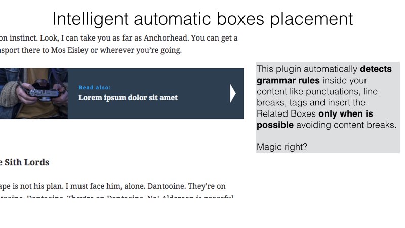
I can't get the divs to line up using percentages, they overlap. If I use fixed width then they float the following text (float: left). I can't get the "clearfix" to work.

This might be very basic, but can you refer me to something for making a div like the one at the div?
 
@ragnar, you're saying your div's are overlapping with percentages, which makes me think you're having the classic problem with the box model.

What happens is you apply a percentage-based width to the main area, but then if you add on padding and margin and a border, that's extra width. So you may have taken care to add up the internal widths like 66.66% + 33.33% = 100%, but as soon as you add padding / margin / border, you go over 100%.

The easiest way to fix this is to make it so the padding, margin, and borders are considered in the calculation of the general width. It will automatically adjust the width to accommodate those extra widths so you don't have to get into a ton of funky math. The way to do that is:

Code:
box-sizing: border-box;

Apply that attribute to both boxes and you should see it all fall into alignment without any other intervention, if I'm understanding correctly.

A lot of CSS guys will apply that universally at the start of a project and never worry about it again like this:

Code:
html {
    box-sizing: border-box;
}

*, *:before, *:after {
    box-sizing: inherit;
}

You would only do this if you're creating a theme or design from the ground up, or it'll destroy the current design.
 
There are many ways to do it of course. One that can work well is Flexbox. Especially where the use case is "2D" in nature. In short, you basically:
  • Put everything in a parent element (let's just say a div) and set to display flexbox.
  • Align items on the parent element however you want.
  • Set your desired custom CSS on each element individually.
  • Maybe add media queries to make things look nice on mobile.
Let's say this is the element and surrounding text from your example image above:
Code:
<h1>Intelligent automatic boxes placement</h1>
    <p>Lorem ipsum dolor sit amet, consectetur adipisicing elit.</p>
    <div class='related-content-box'>
        <div class='related-post-img'>
            <img src="https://placehold.it/600x100" alt="">
        </div>
        <div class='gray-box'>Lorem ipsum dolor sit amet, consectetur adipisicing elit. Esse, obcaecati. Voluptatibus odit debitis veritatis.</div>
    </div>

First we take care of the flexbox setup for the parent element:
Code:
.related-content-box {
    display: flex;
    align-items: center;
    justify-content: center;
}

Then we customize each child component a bit:
Code:
.related-post-img {
    max-width: 100%;
}

.gray-box {
    background: #efefef;
    padding: 1rem;
    margin: 1rem;
}

Lastly, we throw in a media query:
Code:
@media screen and (max-width:990px) {
   .related-content-box {
       flex-wrap: wrap;
   }

   .gray-box {
       flex-basis: 100%;
   }
}

That's pretty rough, and I'm sure could be done better. You'll want to do some browser testing, and determine if you're going to need any fallbacks. I'd always recommend checking "Can I Use" for specific things like this. If most of your users are on newer browsers, there shouldn't be much of any issue, as flexbox is widely supported now. Here's a great guide to Flexbox.
 
Back