Navigation
Install the app
How to install the app on iOS
Follow along with the video below to see how to install our site as a web app on your home screen.
Note: This feature may not be available in some browsers.
More options
You are using an out of date browser. It may not display this or other websites correctly.
You should upgrade or use an alternative browser.
You should upgrade or use an alternative browser.
Black, Red and ...
- Thread starter bernard
- Start date
- Joined
- Apr 7, 2016
- Messages
- 349
- Likes
- 239
- Degree
- 1
What's wrong with what you got? That looks good. Came up with some similar palettes:
Code:
https://coolors.co/000000-cad178-d3d57c-c7aa74-d80032
https://coolors.co/000000-e9b872-90a959-6494aa-d80032
https://coolors.co/000000-643a71-8b5fbf-d183c9-d80032
https://coolors.co/000000-87b38d-f2b7c6-ead7d1-d80032bernard
BuSo Pro
- Joined
- Dec 31, 2016
- Messages
- 2,652
- Likes
- 2,339
- Degree
- 6
Black and red is fine, but it gets a little stale, when I want to do stuff like info boxes and such. I usually use a light-green or light-blue for that.
Those are some nice palettes you did too, the one with the pinks and green is pretty cool. That goes well with food, pink for desserts, green for mains.
Those are some nice palettes you did too, the one with the pinks and green is pretty cool. That goes well with food, pink for desserts, green for mains.
- Joined
- Sep 3, 2014
- Messages
- 6,332
- Likes
- 13,318
- Degree
- 9
as my site is food/wine/coffee related:
I'd be trying to think about color psychology here. The watermelon feel does relate to food, but it most strongly exudes a sense of summer, hotness, and refreshment. I'd say neither of these really fits wine or coffee.
I'm winging it here but watermelon is too playful if you're heavily pulling wine and coffee into the mix. Those aren't fun products or regular ones unless you want to make peanuts on commissions, etc. They're luxury products.
For wine I'm immediately thinking a dark satin red like a red wine. For coffee I'm thinking browns mixed in. The watermelon color could work though if you're mainly doing food, though. At the end of the day you can make any of it work but I'd be careful about mixing playful and luxury together. That's not at all what luxury people are trying to achieve.
I like black and red, too. I usually will mix it with a blue as my color meant to pop on buttons and all that. Black is text. Red is the main accent color for headers and images. White is the main background color. And blue is the visual pop color. But this is for male dominated, maybe more tech-ish niches.
bernard
BuSo Pro
- Joined
- Dec 31, 2016
- Messages
- 2,652
- Likes
- 2,339
- Degree
- 6
Yeah, I agree, but you got to be careful imo with the black/red, it can get dull and intimidating real quick, particularly if you're also marketing to women.
All those food and recipe blogs run by women are not black/red, they're pastel colors.
Black/red is for expensive knives, espresso makers, gasgrills etc etc.
I'm honestly thinking about redoing the entire color scheme, to something more gender neutral.
All those food and recipe blogs run by women are not black/red, they're pastel colors.
Black/red is for expensive knives, espresso makers, gasgrills etc etc.
I'm honestly thinking about redoing the entire color scheme, to something more gender neutral.
- Joined
- Apr 7, 2016
- Messages
- 349
- Likes
- 239
- Degree
- 1
Check out Vinepair's article section. Their theme is black, white and a coral/red color. They bring out some deeper earthier tones in their featured images in the coffee and wine sections.
bernard
BuSo Pro
- Joined
- Dec 31, 2016
- Messages
- 2,652
- Likes
- 2,339
- Degree
- 6
Check out Vinepair's article section. Their theme is black, white and a coral/red color. They bring out some deeper earthier tones in their featured images in the coffee and wine sections.
That's really well done.
They use their illustrations and featured images to offset the black/red with color explosions. Really cool.
- Joined
- Apr 23, 2019
- Messages
- 214
- Likes
- 168
- Degree
- 1
When I think wine and top quality, I think Purple.
If it was only luxurious I would say purple with a smidge of yellow.
I personally dislike the Vinepair method, to me there are too many colors on the screen.
But I will admit that the colors they use are "calmer" than most, and that seems to be a very good thing for this sort of niche. (Like Ryan said, the "deeper earthier tones").
Purple + yellow is tricky to get right and it feels wrong for coffee. By maybe if you manage to make them "earthy" enough.
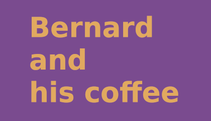
Here is my try to get a good "feel" for the direction I would go:

I think this feels fine. Maybe a little bit less purple and a bit more "popping" for the text.
Edit: I noticed I focussed maybe too much on coffee and whine and not on food.
But maybe I'm overthinking it.
If it was only luxurious I would say purple with a smidge of yellow.
I personally dislike the Vinepair method, to me there are too many colors on the screen.
But I will admit that the colors they use are "calmer" than most, and that seems to be a very good thing for this sort of niche. (Like Ryan said, the "deeper earthier tones").
Purple + yellow is tricky to get right and it feels wrong for coffee. By maybe if you manage to make them "earthy" enough.
Here is my try to get a good "feel" for the direction I would go:

I think this feels fine. Maybe a little bit less purple and a bit more "popping" for the text.
Edit: I noticed I focussed maybe too much on coffee and whine and not on food.
But maybe I'm overthinking it.
- Joined
- Dec 17, 2015
- Messages
- 218
- Likes
- 125
- Degree
- 1
I often use Kuler https://color.adobe.com/create/color-wheel
Just set your base colour in the middle and then see what it brings up for the other harmony rules such as complementary, triad etc. You can also explore others colour themes.
Just set your base colour in the middle and then see what it brings up for the other harmony rules such as complementary, triad etc. You can also explore others colour themes.
