- Joined
- Sep 3, 2014
- Messages
- 6,329
- Likes
- 13,318
- Degree
- 9
I thought it'd be fun to share pieces of web design that we come a cross in our day to day lives, the ones that make us stop for a second and think, so that any of us can return to this thread in the future and take inspiration before we build our next site.
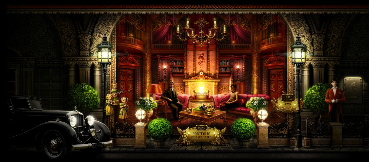
Today this struck me:

What caught my eye most was how the logo sticks above the "Trending Now" middle portion, only to have it's symmetry balanced by the social signal icons and the "new articles" box on the right. I also appreciate the cram-packed category navigation with their expandable mega-menus.
Today this struck me:
What caught my eye most was how the logo sticks above the "Trending Now" middle portion, only to have it's symmetry balanced by the social signal icons and the "new articles" box on the right. I also appreciate the cram-packed category navigation with their expandable mega-menus.